How to Fix Common Printing Issues with Premium Business Card Printing
June 18, 2025
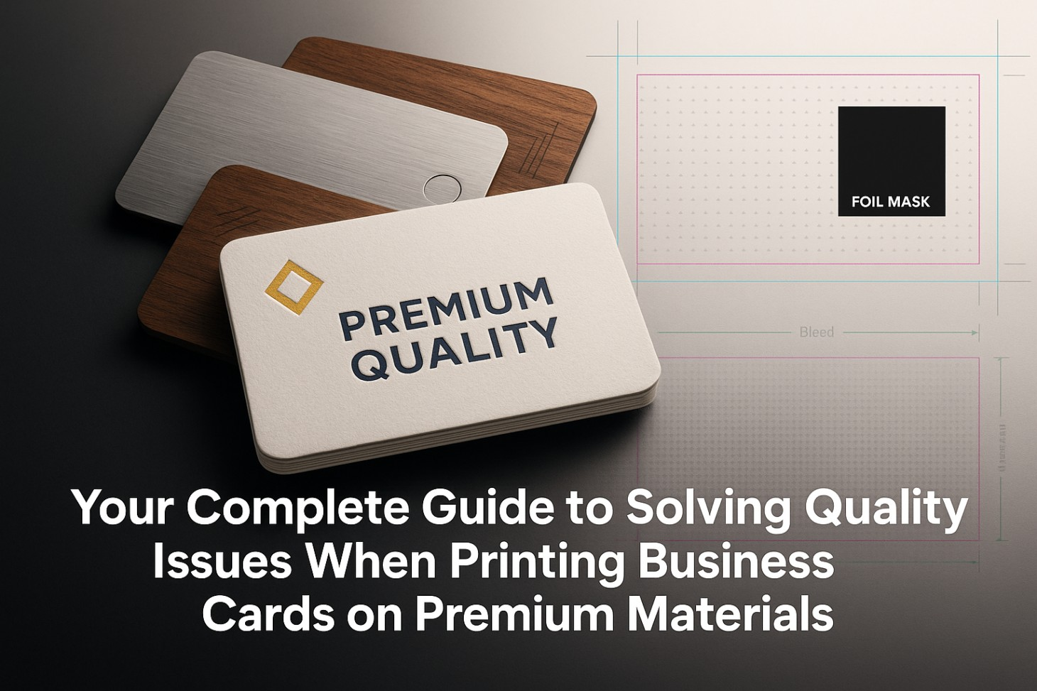
Lately, the business card printing world has seen a real surge in the use of premium materials. More and more people are after luxury cards with custom designs such as metal, wood, or thick, textured paper, driving a noticeable shift in market trends. Yet even as demand surges, figuring out how to solve quality problems when printing on premium materials is still a major headache for professionals who want their business cards to truly stand out. When you consider that around 10 billion business cards are printed every year in the U.S. alone, it’s clear that knowing how to manage quality control for premium materials is more important than ever.
Standard troubleshooting guides rarely cover the tricky problems that come with printing on premium business card materials. Whether it’s tricky color matching on textured paper or dealing with finishes that don’t quite hold up, working with high-end materials takes a whole different set of skills and know-how if you want every card to look sharp and consistent.
Why Quality Problems with Premium Materials Are a Bigger Deal Than Ever
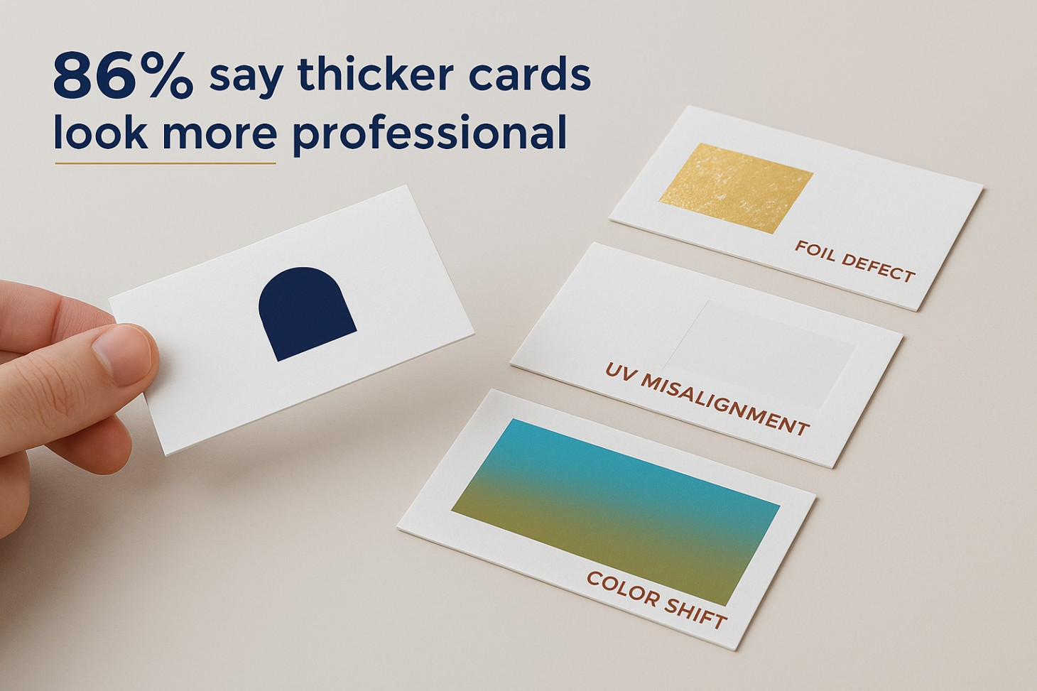
Business networking looks very different these days, 86% of customers now say that thicker business cards make someone seem more professional. The move toward premium materials really shows just how much first impressions matter in today’s market. Almost four out of ten people say they’ll walk away from a deal if someone hands them a business card that looks flimsy or low-quality, which makes getting quality control right for premium cards more important than ever.
According to recent market research, people tend to hang on to colored business cards up to ten times longer than plain white ones. But getting colors to look the same every time on premium materials like textured papers or cards with special finishes comes with its own set of challenges you just don’t run into when using regular cardstock.
When it comes to premium materials, the risks are much greater. Defects show up far more often than they do with standard printing. A real-life case shared on Reddit described a batch of foil-printed business cards where about one in five had problems, anything from scratches to patches where the foil didn’t stick properly. When quality slips, it’s not just costly materials that go to waste, your professional reputation can take a real hit, too.
What Makes Printing on Premium Business Card Materials So Tricky
Problems You’ll Face with Heavyweight Cardstock
Most premium business cards are printed on cardstock that falls between 250 and 400 GSM, a far cry from the much lighter 80-100 GSM paper you’ll find with standard cards. Most laser printers can’t handle paper heavier than 220 GSM, which means you’ll run into problems right away if you try to use thicker stock. Try to run thick, heavy cardstock through a printer that isn’t built for it, and you’ll quickly run into trouble such as paper jams, fuzzy prints, and even damage to the machine or your cards.
How heavy and dense your premium cardstock is can really change how the ink soaks in and how quickly it dries. Thicker papers, like those in the 250-300 GSM range, do a great job soaking up ink and stopping bleed-through, but they also mean you’ll need to tweak your printer settings and allow for a bit more time to get the job done right. If you overlook these details, you’ll likely end up with smudged prints, blotchy colors, or spots where the ink just doesn’t stick.
The Trouble with Printing on Textured Paper
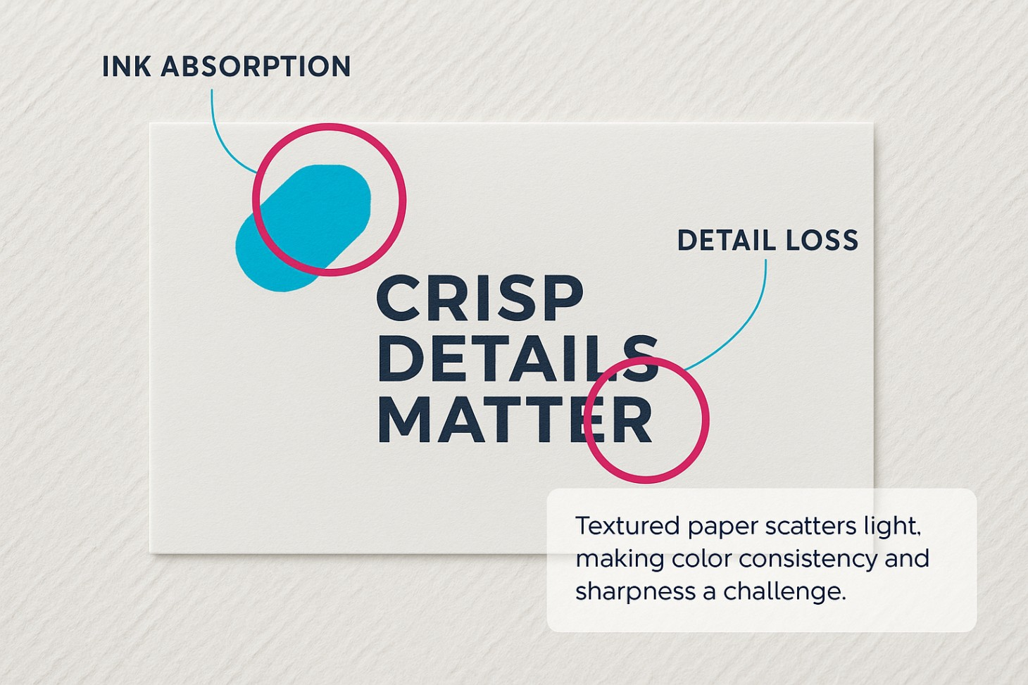
Papers with texture, like linen, laid, or felt, bring their own set of headaches when it comes to getting colors right and keeping printed details crisp. Research has found that the texture of paper can really change how we see color. It scatters light in all sorts of directions on rougher surfaces, which leads to uneven ink absorption and can even affect how glossy the finished print looks. Because the light scatters unevenly, getting colors to come out the same way every time becomes a real challenge so your prints can end up looking a bit inconsistent from one run to the next.
Sometimes, the texture of the paper actually gets in the way of certain printing methods. When you try letterpress printing on really textured paper, the design sometimes doesn’t press in all the way. On the flip side, digital printing often has trouble getting the ink to stick evenly on those bumpy, uneven surfaces. Textured materials can really wreak havoc on fine details and small text. Those little bumps and grooves can make even the sharpest designs look pixelated or blurry, no matter how crisp your original files are.
When Special Finishes Don’t Hold Up
Premium finishes like foil stamping, spot UV coating, and embossing helps to add a whole new level of complexity to the process. Foil stamping can sometimes go wrong, lines or entire sections might not get covered properly, leaving gaps in the design. Shifts in temperature or pressure while applying the foil can actually kick up dust, especially around intricate designs or tiny lettering.
When spot UV coating goes wrong, you’ll often notice the gloss looks patchy or doesn’t stick well to some types of paper. Sometimes the coating ends up looking cloudy, forms air bubbles, or just doesn’t set the way it should, especially when the conditions aren’t quite right. These problems really tend to crop up when you try layering several specialty finishes onto a single card.
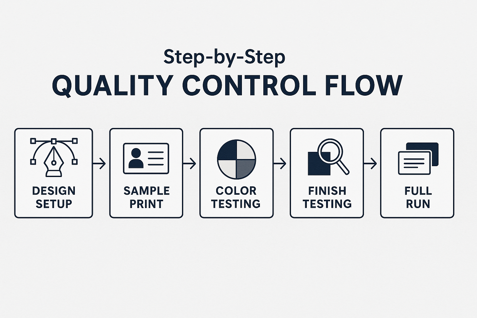
A Practical, Step-by-Step Approach to Quality Control with Premium Materials
Getting Pre-Press Prep Right
If you want your premium materials to print perfectly, it all starts with careful prep work before you even hit “print.” Begin by double-checking that every design file matches the exact specs for the materials and printing techniques you’ve picked out. That means you’ll want to double-check that you’ve got enough bleed, usually about 0.125 inches or 3 mm for business cards, make sure every bit of text stays safely inside the margins, and switch all your colors from RGB to CMYK before sending your files off to print.
If you’re working with textured materials, it’s smart to run a few test prints on small samples before you dive into a full production run. This way, you can see firsthand how your particular design works with the texture you’ve picked, and tweak things like font size, line thickness, or color as needed. Keep in mind, if your text is smaller than 8 points, it can easily get lost or become unreadable on papers with a lot of texture.
Fine-tuning your files is absolutely essential when you’re working with premium materials. Make sure to flatten any transparency effects, turn your text into outlines so you don’t run into font problems, and double-check that every linked image is embedded at 300 DPI. Set up individual files for each special element like foil masks or spot UV sections and make sure to use solid black (C0 M0 Y0 K100) anywhere you need those effects applied.
Getting Color Right on Textured Surfaces
If you want colors to come out right on textured materials, you first need to understand how the paper’s surface changes the way we see those colors. When paper has a rough texture, it scatters light unevenly and that can actually make colors look different than they would on a smoother sheet. The smoother the surface, the fewer color mistakes you’ll see and you’ll also get richer, more vibrant colors and a glossier finish.
Fine-tune your color settings for every textured material you’re planning to print on—what works for one paper won’t always work for another. Color profiles that work fine on smooth paper just won’t give you reliable results when you switch to textured stock. If you often work with certain premium materials, it’s worth making custom ICC profiles for them, this way, your colors will stay consistent from one project to the next.
If you’re working with textured materials, steer clear of using very subtle dark gradients—CMYK printing on those surfaces tends to make shadows look even heavier than you’d expect. Don’t just trust what you see on your monitor—check important colors on real, card-sized samples under normal lighting to make sure they look right in the real world.
Want to take your premium material prints to the next level? Mastering advanced color management techniques can make a world of difference.
How to Put Quality Checks in Place
Build quality checks into every stage of your production process. Start by creating detailed digital proofs that closely mimic what the finished product will look like. This gives you a chance to review and make any needed tweaks before committing to a full production run. Proofs matter even more when you’re working with premium materials, since fixing mistakes later can get expensive fast.
Set up strict quality checkpoints along the way, and be sure to use densitometry to keep a close eye on ink density so everything stays consistent from the first card to the last. Check each ink color on its own, comparing its actual density to what you expect. This way, you can catch any issues before they turn into bigger problems down the line.
When it comes to specialty finishes, set up durability tests that actually mimic how people will handle the cards in everyday life. To test foil adhesion, gently rub a finished card with a soft cloth. For spot UV coating, check how it holds up under different lighting. And don’t forget to make sure any embossed details still look crisp, no cracking or flaking allowed.
Where People Go Wrong with Premium Materials and How to Avoid It
Common Mistakes When Preparing Design Files
Not leaving enough bleed or setting the right margins for premium materials is one of those expensive mistakes that can really come back to bite you. With premium materials, you usually need to allow for bigger bleed areas than you would with regular business cards, since thicker cardstock calls for wider cutting tolerances. Before you lock in your designs, double-check the details with your printer to make sure you’re meeting all their requirements.
Choosing the right font really matters when you’re working with premium materials. Steer clear of very thin or light fonts. They can end up looking faint on textured paper, or sometimes don’t print clearly at all depending on the technique you use. Stick to at least 8-point fonts for your body text, and double-check that your text stands out clearly from the background.
Mix-ups with color modes are another issue that crops up all the time. If you set up your files in RGB, the printed colors can end up looking flat or off—especially on premium materials, where getting the colors just right really matters. Make sure you’re working in CMYK from the start or at least convert your files before sending them off. And if you want your blacks to look truly deep and rich, use the values C60 M40 Y40 K100.
Where People Go Wrong When Choosing Materials
Pick cardstock that’s too heavy for your printer, and you’re almost guaranteed to run into all sorts of quality problems. Before you commit to using extra-heavy cardstock, make sure your printer can actually handle that weight, otherwise, you risk sacrificing print quality. Think about how the cards will actually be used. Cardstock over 400 GSM has an impressive, high-end feel, but it can be a hassle if your cards don’t fit into regular business card holders.
Choose your paper’s texture based on how detailed your design is. Heavily textured materials really shine when paired with bold, straightforward designs—such as fine details or tiny text tend to get lost in all that texture. If your design is intricate, you’ll get much better results by sticking with smoother premium materials which are far more likely to capture those tiny details cleanly.
Where Things Go Wrong During Finishing
A lot of premium material failures can be traced back to finishing specs that just aren’t quite right. When you’re ordering foil stamping, make sure your mask files are clear and accurate so it’s obvious exactly where the foil should go. If your mask files aren’t set up properly or are inconsistent, you’ll end up with foil that doesn’t fully cover where it should or worse, you might find shiny foil popping up in places you never wanted it, like the background.
You’ll need to plan carefully to make sure each finishing step lines up at the right time. Give UV coatings enough time to fully cure before adding any other treatments, and plan your finishing steps carefully so you don’t accidentally damage any delicate details along the way.
Questions People Ask All the Time
How heavy of a cardstock can I actually run through a regular printer?
Most laser printers can handle paper up to about 220 GSM, but if you’re using a high-end digital press, you can usually go as thick as 350 to 400 GSM. Before you place an order for heavy cardstock, double-check that your printer can actually handle it.
What’s the best way to keep colors from looking off when printing on textured paper?
For every textured material you use, make a custom color profile, steer clear of subtle gradients that might end up looking too dark, and be sure to test your key colors on real material samples before you commit to a full production run.
Why does foil stamping sometimes go wrong?
Usually, problems crop up because the mask files weren’t set up right, the temperature or pressure was off, the foil surface wasn’t clean, or the materials just didn’t work well together. Make sure your mask files have solid black where you want coverage, and pay close attention to the temperature and cleanliness of your workspace while applying finishes.
Do I need to change up my design when I’m working with premium materials?
Absolutely, when you’re working with premium materials, you’ll usually need to tweak your designs. That might mean bumping up font sizes for textured papers, streamlining graphics so they print cleanly, and fine-tuning your color choices to suit the unique qualities of the material.
Expert Take: Why Testing Your Materials Really Matters
One thing people often forget when producing premium business cards is to thoroughly test their materials before placing a big order. Seasoned print pros know all too well: every mix of premium material, printing process, and finishing touch comes with its own unexpected hurdles. What worked last time won’t always save you now. Making 25 to 50 test cards with your exact specs and materials costs just a tiny fraction of what you could lose if a full production run goes wrong—yet in the rush to hit deadlines, plenty of businesses still skip this vital step.
Your Go-To Checklist for Flawless Premium Business Card Quality
Want your premium business cards to look flawless every time? Here’s a handy checklist to help you sidestep common pitfalls and get polished, professional results every time:
Double-Check Everything Before:
- Make sure your chosen cardstock’s weight (GSM) actually works with your printer.
- Double-check that you’ve allowed enough bleed to account for the wider cuts needed with thick cardstock.
- Try out your key colors on real samples of the material before moving forward.
- Make sure to set up custom color profiles for any textured materials you’re using.
- Set up individual files for each special finish, and make sure they’re formatted correctly.
Making Your Design Work
- Make sure you switch all your files over to CMYK color mode.
- Stick with fonts that are at least 8 points when you’re printing on textured paper.
- Be sure to flatten any transparency effects and turn your text into outlines.
- Double-check that every image is set to 300 DPI.
- For deep, solid black areas, use the rich black values: C60 M40 Y40 K100.
Putting Your Quality Checks to the Test
- Run a batch of test cards using the same specs you’ll use for your final order.
- Put your specialty finishes to the test—check how well they hold up in real-world use.
- Double-check that your colors look right in the kind of lighting and setting where people will actually see your cards.
- Take a close look to make sure the finishes stick properly and the coatings are holding up well.
- Try sliding your cards into regular business card holders to make sure they actually fit.
The world of premium business cards just keeps moving forward, with new, more sophisticated materials and finishing touches popping up all the time. To get it right, you need to really understand the quirks of these materials and put solid quality control steps in place every step of the way.
At Inkcredible Solution, we know the ins and outs of premium business card production. Our team blends hands-on experience in luxury printing with top-notch quality control, so your cards always make the right impression. We take a thorough, hands-on approach so your investment in premium materials pays off with the polished, professional results your brand truly deserves.
Tired of dealing with quality problems on your premium business card orders? Get in touch with Inkcredible Solution today, and let’s talk about what you need. Our team of premium printing experts is here to make sure your business cards look sharp, polished, and memorable every single time.
Need Flawless Premium Business Cards?
Contact Inkcredible Solution for expert guidance on fixing printing issues and producing premium business cards that impress from the first glance.
Get in Touch